FEATURE:
Strike a Pose

THIS COVER: Slowthai - Nothing Great About Britain/MAIN IMAGE CREDIT: Crowns & Owls/ALL OTHER IMAGES/COVERS: Getty Images/Spotify
The Power of a Truly Fantastic Album Cover
__________
THE image that I have used for...

THIS COVER: The Beatles - Abbey Road
the top of this article is from the cover of Slowthai’s upcoming album, Nothing Great About Britain. Who knows what one will expect from the record but I feel like, obviously, there is dissatisfaction with the state of the nation: the political divides and how we are all sort of drifting away at the moment. It sounds bleak but, at times like this, artists are reflecting what is happening. Rather than portray an image that is quite bleak or overly-serious, the cover catches the eye. Consider the stocks at the front and the cheeky grin on the face of Slowthai. Look back at the flats and the Union flags hanging from the bannisters. It seems to say so much without giving too much away. I like the fact that Slowthai could have gone for a rather straight and boring cover but, given the title of his record, he has been thinking and created something that intrigues you. I am not suggesting a cover is powerful enough to make you buy the album but it is definitely an important factor. Look at the classic album covers from history and the affect they have now. Whether it is the simple-yet-iconic image on The Dark Side of the Moon by Pink Floyd; the underwater baby of Nevermind or The Beatles’ triple-masterpiece designs on Sgt. Pepper’s Lonely Hearts Club Band, The Beatles and Abbey Road. There are some rather poor albums that have great covers and, conversely, some top records that boast some rather woeful covers.

THIS COVER: Billie Eilish - WHEN WE ALL FALL SLEEP, WHERE DO WE GO?
It is always satisfying when you pick up a classic that has that aesthetic genius and this is backed up by a stunning and imaginative cover. This is a subject I have covered before but I keep saying how important it is to create a great album cover. Even though the music industry is more digital and Internet-based, that is not to say the visual side of things should be ignored. I do feel that artists need to concentrate on the visual element because it holds that potency and importance. Even if we are getting music from Spotify, there is an image associated with a song or album. Those who still love their vinyl do adore a great cover/sleeve so artists have the opportunity to create something truly staggering! Every year, I love to look at the best album covers and see if there is a correlation between the music we hear and the image on the front. Look at recent albums such as Billie Eilish’s WHEN WE ALL FALL ALSLEEP, WHERE DO WE GO? and its ghoulish, rather scary image. It is the young Eilish with those piercing white eyes; a sort of demonic figure that is stalking someone’s dreams. There are questions one asks and considers: Is she awake or is this a dream? What does the image say and what are we to take away? What has struck me most about the best albums of this year so far is, actually, how casual the artwork has been.

THIS COVER: Julia Jacklin - Crushing
I will talk about some of last year’s best but, in terms of 2019, Slowthai is setting an example! Apart from the charm and cuteness of Julia Jacklin’s Crushing – where one smiles at the image and it sort of juxtaposes an album that is emotionally raw and fraught at times – some of the biggest records go for a trope: the artist in profile; a simple portrait that holds no true intrigue and nuance. From James Blake’s Assume Form and Sleaford Mods’ Eton Alive; Little Simz’s GREY Area to Sigrid’s Sucker Punch and Solange Knowles’ When I Get Home. I look at those covers and, whilst the music within is great, I wonder whether a more arresting and striking album cover could have been created! It is a missed opportunity when you put out an album. Although we do not have the same culture regarding C.D.s, cassettes and vinyl; I do think a great album cover is important and says a lot about the music/artist. Even though I have not yet listened to Foals’ Everything Not Saved Will Be Lost, Pt. 1 - not a fan of that title! – it has a brilliant cover and you are definitely struck by it. Whereas Slowthai has gone for something cheeky and political, Foals have gorgeous image that looks like a film still – an apartment and plant that clashes black-and-white against pink. I am not sure where the shot was taken and what the plant is but it is an image that draws you in and, for me at least, I do wonder what inspired them to use that shot.

THIS COVER: Foals - Everything Not Saved Will Be Lost, Pt. 1
The difference between a truly inspiring album cover and a boring one can make a big difference. Whilst there is no doubt about the majesty of Little Simz and Solange Knowles, I do wonder whether their album covers’ looks were correct; whether they missed out on creating a wondrous and jaw-dropping images. Consider some of the more pleasing and standout images from this year’s albums. From the slightly disturbing and busy image on Dave’s PSYCHODRAMA to the cluttered floor and childhood scenery of Sharon Van Etten’s Remind Me Tomorrow – a cover that holds clues and raises questions; one where you get a sense of the music/themes within. Even if you have this image that catches you by surprise because of its intensity or oddness, this is what you want from a cover! I love the visual style of The Twilight Sad’s IT WON/T BE LIKE THIS ALL THE TIME and would not normally have checked out their music. I did and, after a cursory listen, I was invested in the album and will keep listening. From the mix of sexual/alluring and confident from Jenny Lewis (On the Line) to Self Esteem (Compliments Please), I do like the fact that there are artists taking time to consider album covers and not only what that says about them but how it guides the music. There is something mesmeric – not in a sexual way – about the shot from Jenny Lewis’ On the Line or the slightly busier and bolder statement from Self Esteem.

I am not usually a fan of portraits or the artist appearing on the cover with nothing else but one album that did win me in that sense is Lucy Rose’s No Words Left. This is a black-and-white shot where the artist’s face is covered by her hair and there is something mysterious about that. You ask whether that image represents a need to be hidden or certain facelessness. I think you can get people talking and wondering without having a very busy and chaotic image. Last year boasted its share of great album covers. I am a bit ho-hum regarding Ariana Grande’s covers but her signature flipped image has become a staple. For Sweetener, we had this beautiful shot of her and, whilst not complex or challenging, it is definitely recognisable and associated with Grande. ASTROWORLD by Travis Scott is this strange sort of theme park where there is this prevalence of darkness and fire. Consider a simpler shot that could be seen as rather lazy or lacking any imagination. Whilst I content this year’s efforts from Sleaford Mods and James Blake are wasted chances at great images, last year saw Teyana Taylor release K.T.S.E. This album’s cover shows her lying on a bed and it reflects the album’s personal, intimate and revealing songs. The cinematic/filmic colour palette and composition is striking and one is definitely intrigued looking in; curious regarding the music and what the artist is about.
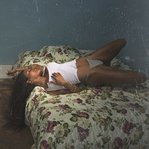
THIS COVER: Teyana Taylor - K.T.S.E.
Also, Missy Higgins’ Solastalgia is about climate change and the impact that is having on all us. The colour palette, again, is perfect and you get this simple-yet-deceptive image that certainly marks it out! Continuing with covers with the artist in focus and the cover image reflecting what the album is about, Hayley Kiyoko’s Expectations is her looking at this nude model and, in a sense, symbolising the fact she takes control of her art and her direction. In essence, it says that Kiyoko is the one who guides her sound and progress. Last year definitely boasted a lot of great album covers. We had the gorgeous painting/image from Madeline Kenney’s, Perfect Shapes and the compelling cover from Triathalon’s album, Online. A lot of artists do favour a portrait or something simple but something a bit more out-there and unusual can work well. Think about the strange and oddly compelling figure from Young Fathers’ Cocoa Sugar or the fantastic composition from U.S. Girls’ In a Poem Unlimited. Editors gave us Violence and, with it, twisted bodies on the cover; Gaz Coombes juxtaposed his World’s Strongest Man boast with an image of her lazing by a pool without any strength needed; Low’s Double Negative relied on a minimalist image that definitely resonated harder than, say, something a bit busier and more packed. It is interesting seeing what strikes us and the covers that stand out. Many artists do go for a simple shot of them but I think that is quite a gamble. Unless you can create something as iconic as The Beatles’ Abbey Road then it can be tricky hooking the imagination that easily.

THIS COVER: Low - Double Negative
I do admit that some of music’s best-ever covers stay with you because there is that singular, straightforward image that says what the music is going to be about and does not need a thousand words. Consider the saucy and slightly sleazy cover for The Rolling Stones’ Sticky Fingers or Sex Pistols’ Never Mind the Bollocks, Here’s the Sex Pistols: two iconic covers that definitely tell you what you expect when you drop the needle on the record! The beautiful artwork on Miles Davis’ Bitches Brew and Fleetwood Mac’s Rumours stands alongside something completely different...such as The Clash’s timeless London Calling. However you do it, I do think artists need to give thought to their covers. I am not sure which covers from the past decade or two can compete with the best – how many can rival Nirvana and The Beatles when it comes to those classic images?! Slowthai started me on this train of thought and I think it is interesting thinking about what defines a great album cover and whether artists today – with all the technology in front of them – are producing better ones than musicians of the past. It is an interesting debate but I do think many artists are missing out and not taking a chance. The very best of this year might still be ahead but there are already signs we are going to see some pretty memorable and awesome examples. Say what you want about the importance of an album cover in a digital age but, to me, a well-composed and stirring image can say as much as…

THE music itself.